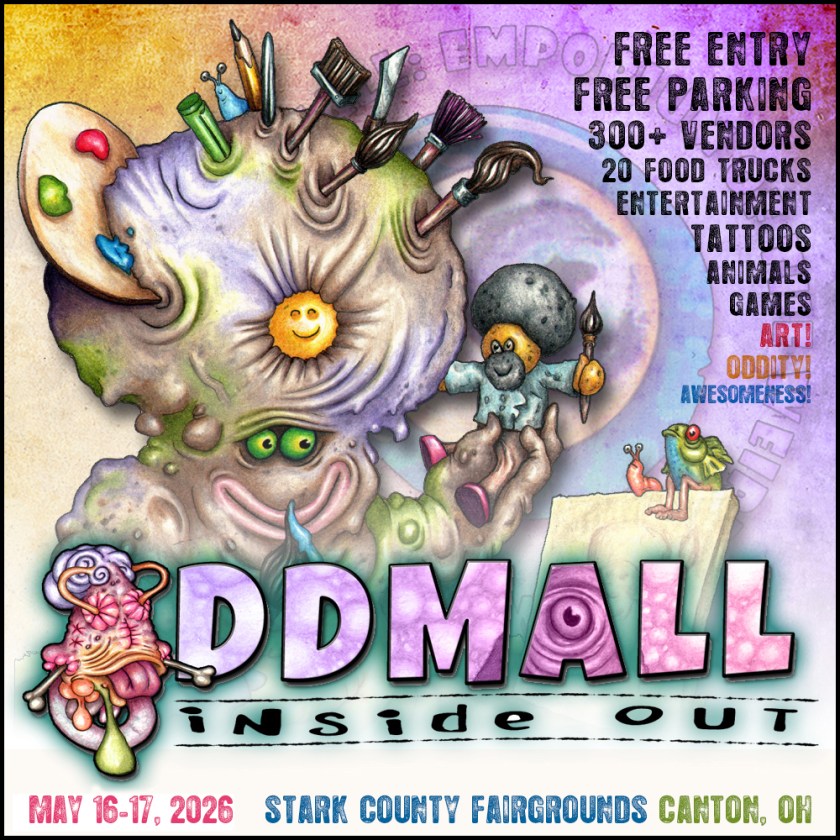
We have a lot of art shows for vendors here in Northeast Ohio, but I’ve learned by trial and error which ones work best for my style and subject matter. I’ve settled on Oddmall, a collective that is, according to the website:
One of Ohio’s largest and most unique exhibitions of art & artifice featuring hundreds of artists, crafters, entertainers, cosplayers, artisans, and purveyors of games, toys, comics, collectibles, and all things odd, geeky, bizarre, imaginative, and wonderful!
I do two of their shows a year, and this coming weekend is my first—Inside Out.
Saturday, May 16, 11am to 7pm Sunday, May 17, 11am to 5pm Stark County Fairgrounds, 305 Wertz Ave. NW, Canton, Ohio
Here are some samples of my art. Stop on by and say hi!
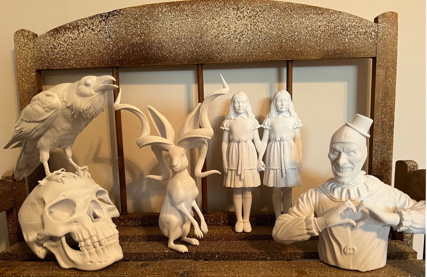
When my son Eric got a 3D printer, I immediately wondered if it was possible to created 3D sculptures based on my original artwork. Eric was more than game to try. I played around with several apps, and finally settled on Tripo, as it was the easiest to use for me and seemed to do what I wanted to do. After a lot of trial and error for both Eric and I, we figured it out, and I’m very pleased with the results. I have an art show coming up, and I’m hoping these are popular.
Below is the final result, along with my original art that was used to create the 3D files.
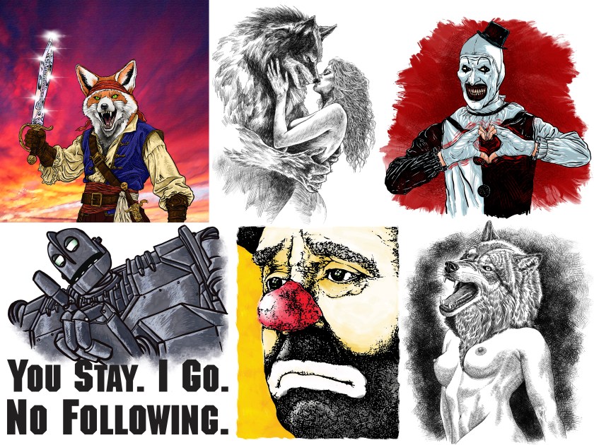
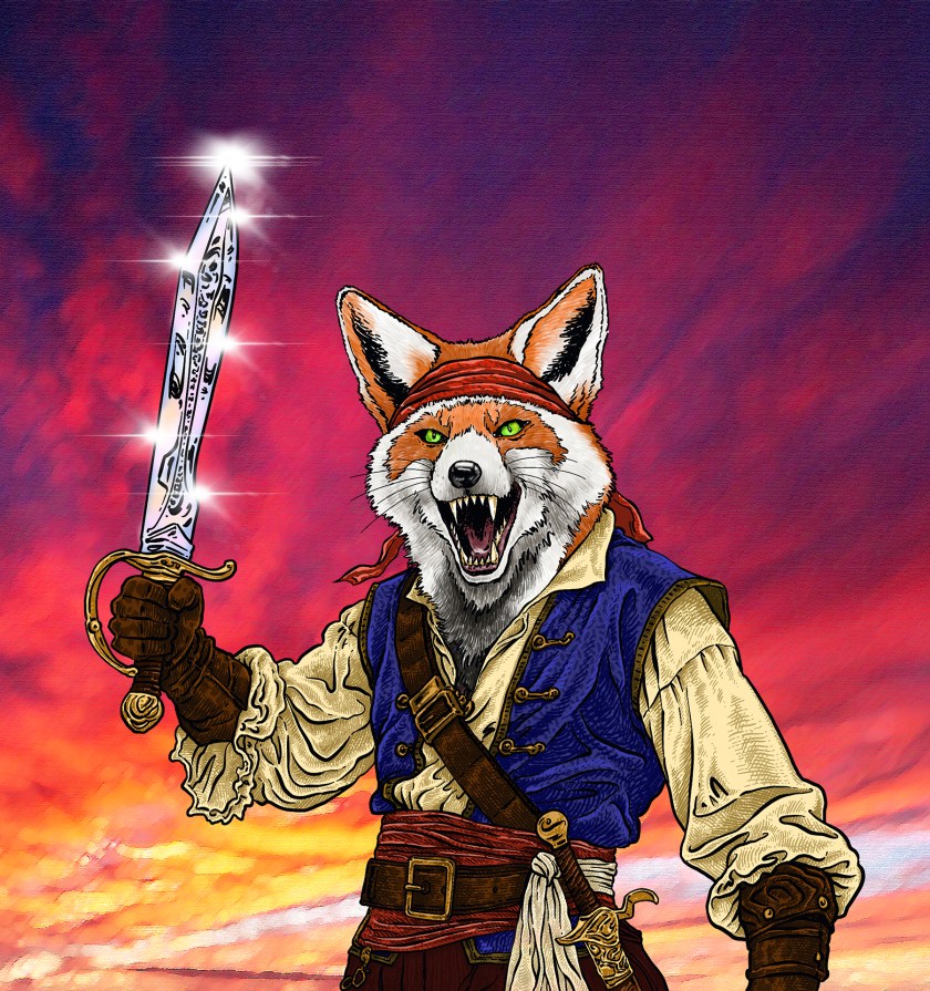
I had a request for a pirate fox drawing, and I’m really happy with the result. Done on an iPad using an Apple Pencil and Procreate. You can find it in my shop here:
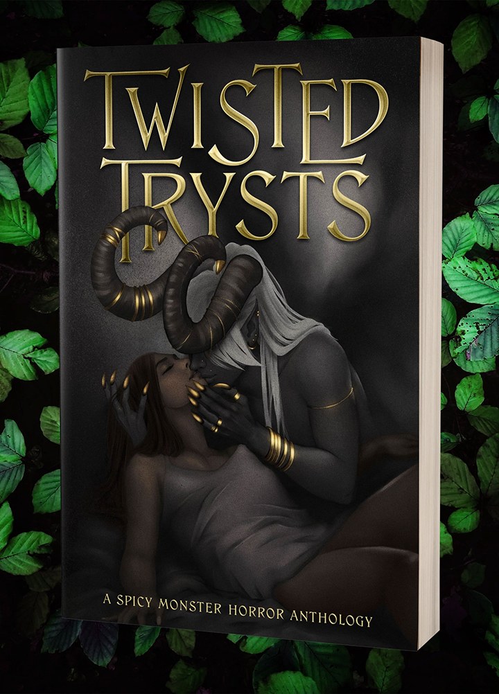
I’m excited to have an illustration in Twisted Trysts, a spicy monster horror anthology from Dead Fox Publishing. My illustration is titled Tentacle Satisfaction, and I think it fits the theme of the collection well.
Here’s the official blurb:
They are the stuff of nightmares, these creatures in the shadows and under our beds, yet we can’t look away.
Fear is part of the allure, after all—drawing us into the woods, into the mist, into the dark water, while others run the other way.
We yearn to be craved by what wishes to consume us.
Open yourself to 23 twisted trysts from authors and illustrators: Hannah Birss, Terry Campbell, Monica Chen, Sam Crain, Astra Crompton, gaast, Arlo Z. Graves, Joachim Heijndermans, LaRita Janae, Tonja K. Johnson, C. Charles Knight, Mandy S Knight, Indigo Larkspur, David O Mahony, Jeannie Marschall, Kelsey Christine McConnell, Dyana McGowan, Evan Noren, David Simon, Jon Stubbington, Nik Sylvan, DC Valentine, Celia Winter
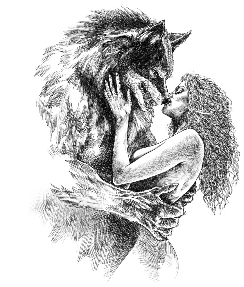
I’ve done the art for several book covers over the past couple of years, and hope to do more. I really enjoy doing them. Here are some of my favorites.
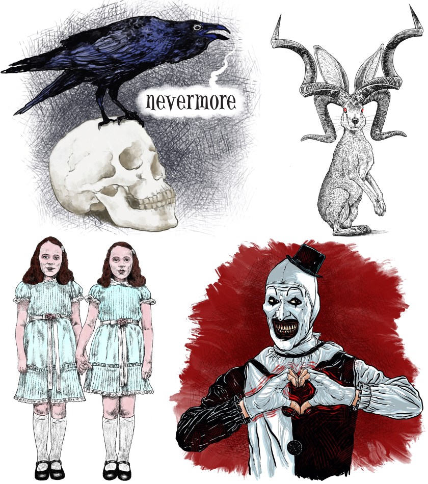
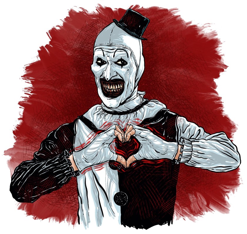
I recently did an art show at one of my favorite venues, Oddmall, and had several requests for Art the Clown from the Terrifier movies. I did this on an IPad with an Apple Pencil using Procreate. A little more graphic than my usual style, but I had a lot of fun doing it.
Created in Procreate with an Apple Pencil on an I-pad. This was challenging and time consuming due to the detail, particularly in the cherry blossoms, but I really enjoyed drawing it.
Big thanks to friends from Norway Sheena and Graham for allowing me the honor of drawing Sookie the Farm Cat. I did this with an Apple pencil on an iPad using Procreate. I tried some new techniques, and I’m really happy with how it turned out (and so are they).
Possible (but maybe not) hot take: Prey is the best Predator movie by quite a bit. I’ve been meaning to do artwork to celebrate it for a while, and here’s the result:
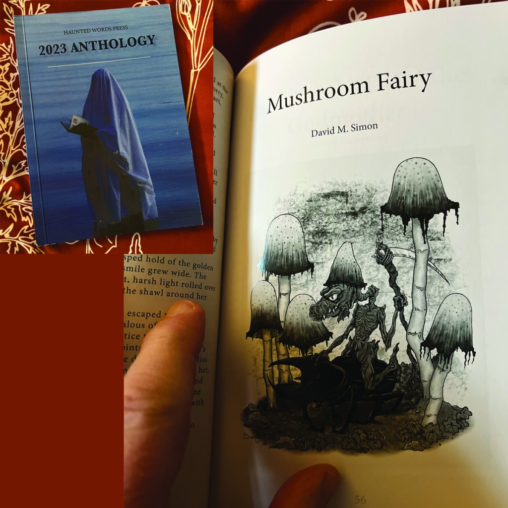
Haunted Words Press recently released their 2023 Anthology, which combines the contents of their three 2023 issues: Resolutions, Wicked Woodlands, and Ghoulish Grimoires. I was happy to have an illustration in the Wicked Woodlands issue, and it’s included here. This piece was done with an Apple pencil on an iPad using Procreate.
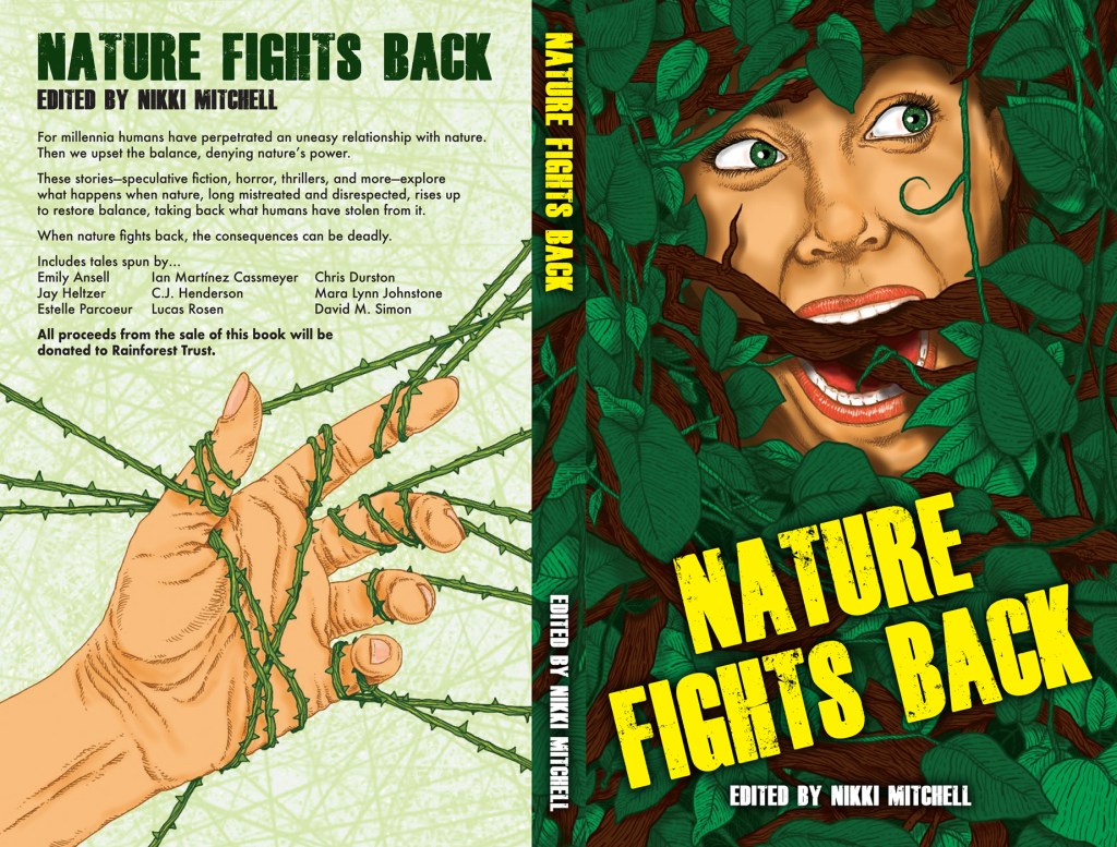
I’m excited to announce a new anthology of original fiction coming soon: NATURE FIGHTS BACK. I’m lucky enough to have a story here, plus I created the cover—drawn with an Apple Pencil on an IPad using Procreate.
Here’s the back cover copy to give you an idea of what to expect:
For millennia humans have perpetrated an uneasy relationship with nature. Then we upset the balance, denying nature’s power. These stories—speculative fiction, horror, thrillers, and more—explore what happens when nature, long mistreated and disrespected, rises up to restore balance, taking back what humans have stolen from it. When nature fights back, the consequences can be deadly.
Includes tales spun by…Emily Ansell, Ian Martínez Cassmeyer, Chris Durston, Jay Heltzer, C.J. Henderson, Mara Lynn Johnstone, Estelle Parcoeur, Lucas Rosen, and David M. Simon.
All proceeds from the sale of this book will bedonated to Rainforest Trust.
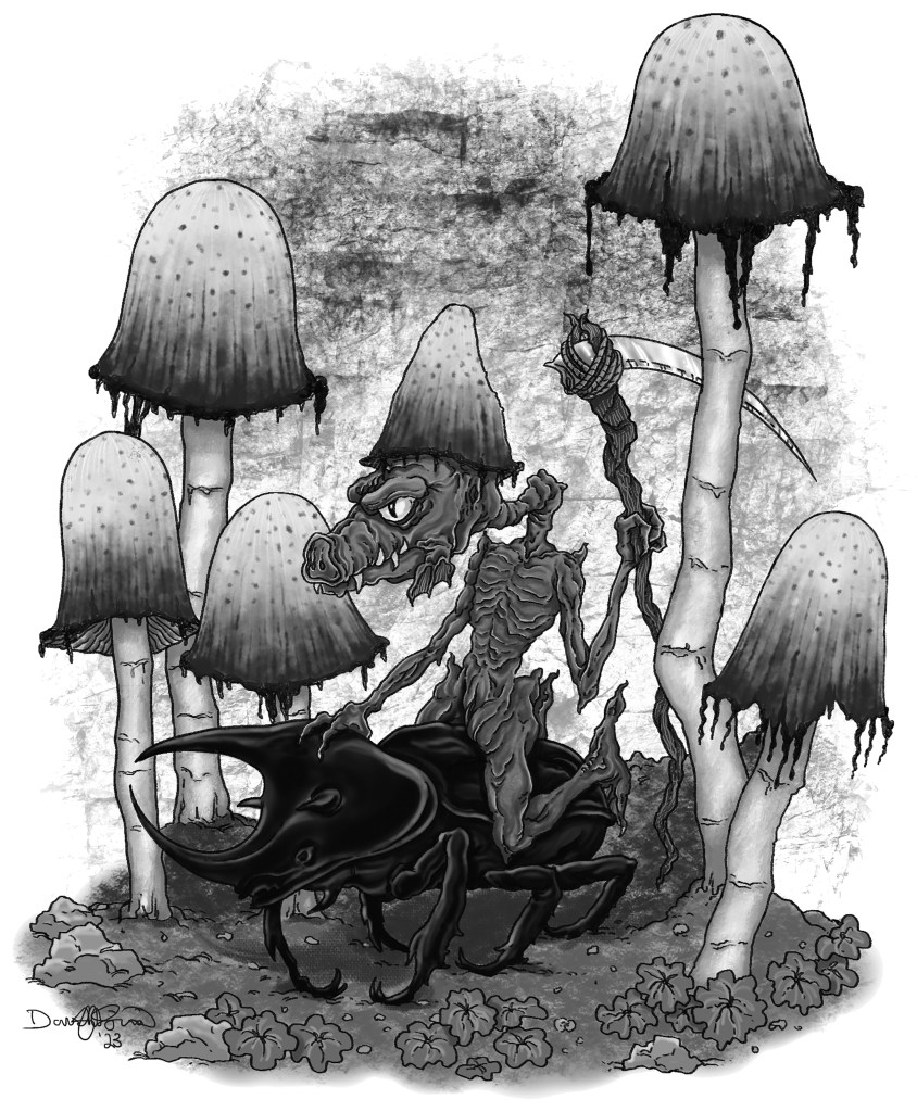
This piece of art appeared in Haunted Woods Press, Issue Five: Wicked Woodlands. I had a lot of fun with this one, and I’ve had several requests to make it available in my RedBubble shop. Drawn with an Apple Pencil and Procreate on an IPad.
I was lucky enough to have one of my illustrations chosen for Haunted Words Press, Issue Five: Wicked Woodlands. This was a fun piece to work on, done with an Apple Pencil using Procreate on an IPad.
Here’s the entire issue for you to enjoy—my illustration is on page 29:
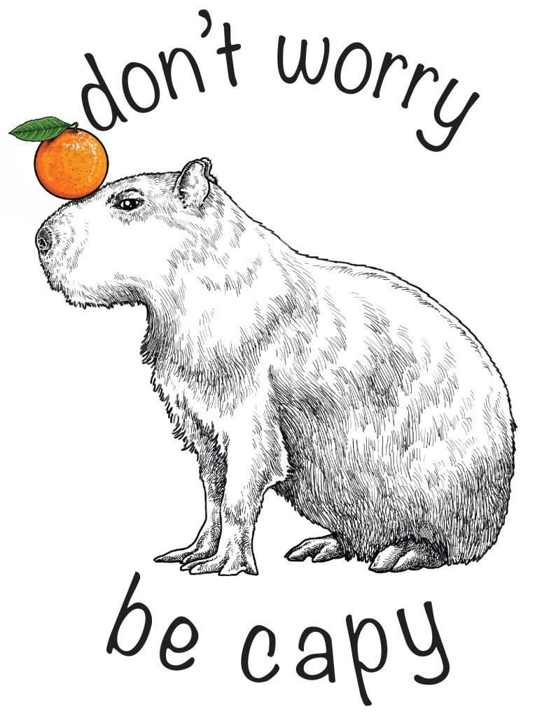
I’ve designed a lot of tattoos over the years, including for all three of my kids. One of my daughter’s friends (Hi, Matt!) recently asked me to design him an oddly, yet delightfully, specific thing: a seated capybara with an orange balanced on its nose. He’s very happy with the result, and I gotta say, so am I.
So. 2022 has been a shitshow, which should not be news to anyone. I’m not just talking about the worldwide shitshow, or the national shitshow, but personally speaking as well. Both my parents and my wife’s parents went through some profound life changes that turned our own lives upside down and consumed a lot of time.
With my free time somewhat diminished, something had to give, and unfortunately that something turned out to be drawing, which this year took a backseat to writing. Still, I managed a few pieces.
Back I the spring I went to see Neil Gaiman on his speaking tour, and wanted to wear something special to commemorate it, so I designed and drew this art for a t-shirt:
In July my son and I went on a once-in-a-lifetime fishing trip that had been postponed for two years due to covid. That trip, up to Great Bear Lake above the arctic circle in the NWT of Canada, yielded two pieces of art. First, something that celebrated the lodge where we stayed, and second, a personal piece for a father/daughter duo we met there. They had a faded photograph of them from when she was young, and asked if I could do something with it. This is the result.
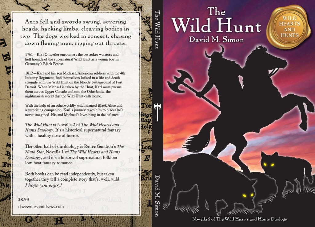
In August I released my first novella for adults, The Wild Hunt, and designed and drew the cover art.
Finally, my son recently commissioned me to do a portrait of his sister’s cats to give her as a Christmas present. Here it is—please don’t tell her.
I also added a couple of new pieces to my RedBubble shop, and had a fun day selling prints of my work at one art show, but that’s about it. Definitely a lean year art wise. Hopefully I’ll be a little more prolific in 2023. I’m planning right now to publish my first chapter book for kids in the coming year, and will create both a cover and chapter illustrations, so that should be fun.
I have always thought of myself as an illustrator, not a fine artist, and I’m cool with that. With that, one of the cool things about illustrations is that they can often be repurposed.
Case in point—my main advertising client for a couple of decades has been SVP Worldwide, one of the world’s largest manufacturers of sewing machines, and that happens to include high-end embroidery machines. When the folks there found out that I was a prolific rubber stamp designer, they asked if we might be able to put together an embroidery collection based on those designs. As it turned out, my contract with the rubber stamp company stipulated that I was welcome to use my art for anything else not rubber stamp related. Like I said, illustrations can be repurposed.
And so, Pen, Ink, and Thread was born, an entire embroidery collection made up of my artwork. I even got my name big above the title. This was many years ago, but I recently on a whim checked and discovered to my surprise and delight that it’s still available. Here’s a link, if you happen to be a machine embroiderer:
While my son and I were at Plummer’s Great Bear Lake Arctic Lodge a few weeks ago, we became friends with a father/daughter duo, Greg and Madi. They shared with me an old photo of Greg taking Madi fishing when she was a toddler, and asked me if I could draw an illustration based on it. Here’s the result, which I’m very happy with. This was created on an iPad using Procreate with an Apple pencil.
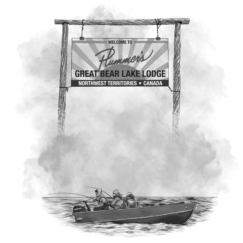
My son Eric and I recently spent a week fishing at Plummer’s Great Bear Lake Lodge above the Arctic Circle. I promised Chuk, the lodge manager, that I would write a story for their newsletter, and do an accompanying illustration. Here’s what I came up with, an image of the lodge sign, along with Eric and I and our guide in our boat with a double hook-up, based on a photo a friend in another boat took. I did this on my iPad using Procreate, and I’m very happy with how it came out.
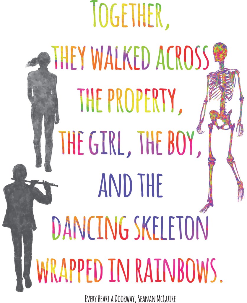
I’ve now had my RedBubble shop for about a year and a half, so it seemed like a good time to look back and see which designs are most popular.
First, my most popular by a long shot, followed by my second most popular. You’ll notice a theme here. Seanan McGuire’s fans are passionate, and I count myself as one of them.
Next is a much more recent addition to the shop, but this one is catching up to the first two.
The next two are favorites for both stickers and masks. I’m guessing high school English teachers are the main reason why.
Finally, my two personal favorite designs that also, happily, get lots of love.
It was the best of times, it was the…okay, it was not a bad year drawing wise. I can boil it down to four categories.
MY REDBUBBLE.COM SHOP I started my Redbubble shop in October of 2020, but in 2021 I really spent time adding content. I’ve had a ton of fun drawing new art that, for the most part, works within my stated theme, which is artwork inspired by iconic books, authors, and movies. I define iconic as books, authors, and movies I like. Hey, it’s my shop.
Am I getting rich from Redbubble? Oh, hell no. The beauty of Redbubble is that they handle all printing and distribution, so I never have to worry about sourcing, say, slim-fit t-shirts, printing them, and shipping them to Paraguay. The downside is that Redbubble takes a huge slice of the pie. I sell more stickers than anything else, and I make, literally pennies on them. I’m not complaining, mind you. I don’t have the time or bandwidth to open an ETSY shop, so this works for me.
My favorite part of the whole thing? Seeing which countries my customers hail from. The fact that a water bottle featuring one of my designs is heading half way around the world is both fascinating and immensely gratifying. My best customer (Twitter friend Sheena and her fiancé Graham) lives in Norway. That is so cool.
AN IPAD, AN APPLE PENCIL, AND PROCREATE Speaking of Redbubble, nearly all the new art I’ve created for it (as opposed to older art that was already completed—some I did all the way back in high school) was done digitally, using an Apple Pencil and Procreate software on my iPad. I love the versatility, the fact that I can try different tools and different techniques and not worry about ruining a drawing, or having to start over. There are lots of other drawing programs out there, but for me at least, Procreate is easy to learn and intuitive. My goal is for you to not be able to tell which artwork of mine is hand drawn and which is digital. I think I’m getting close.
ART MARKETS In 2021 I starting selling my work at outdoor art markets and shows again, something I hadn’t done in decades. I blame my brother Jim. He makes gorgeous, imaginative fairy container gardens, which he’s been successfully selling at shows, and he asked me to share a booth space with him. We ended up doing a bunch of shows together. I rediscovered how much I love hanging out, talking to people about art, connecting with other creative folks. This will definitely continue in 2022. Oh, and I made a few bucks. Win-win.
ANTHOLOGY COVERS I’m a sometimes, somewhat active member of the Twitter writing community, and through that I was lucky enough to connect with a group of immensely talented writers and participate in two fiction anthologies: Heads and Tales: The Other Side of the Story, and the just published Welcome to Simmins, Detective Spencer. I have one story in the first, and two in the second. Our editor for both volumes, Chapel Grahamm, did a wonderful job—keeping a bunch of writers on task and on deadline can be like juggling cats—and I’m extremely proud of my stories in both books.
Dave, you may be asking yourself, what’s that got to do with drawing? Glad you asked! I was asked to create the cover art for both anthologies and happily agreed. Both jobs were fun as can be, and, I think, successful.
Curious? Here are links for both. Heads and Tales is available in both print and e-book editions, and Welcome to Simmins, Detective Spencer is available now as an e-book, with a print edition coming any day now:
Many years ago I created a bunch of art for a small greeting card company. I worked with an excellent art director and really enjoyed the process. I’ve posted some before. here are a few more samples.
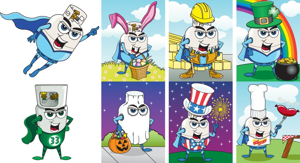
A local propane company asked me to create a logo character for them, and this was the result. The little scenes were for a series of holiday posters. Supertankman has ended up as a 3D printed model, a plush toy, embroidered on jackets and hats—a surprising number of things.
I’m lucky enough to be participating in Heads and Tales, an anthology of reimagined myths, legends, and fairy tales told from both sides of the story. I have a short story here about the Wild Hunt, set during the War of 1812–my story told from the American side, and my co-writer, Renée Gendron, from the Canadian side. The book will debut in July, and I’ll write more about it then. For now, though, I wanted to share the cover art I created for the book. This was done using an Apple pencil and Procreate on an I-Pad. I’m very pleased with the results.
For the past several months, most of my art time has been devoted to new designs for my RedBubble shop. I’m really working on using my I-Pad, Apple Pencil and Procreate software to their full potential, and trying some new styles. Here are my most recent designs, artwork inspired by movies, books, and authors, and a couple of wild cards.