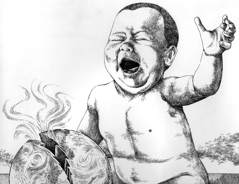
Here’s a new piece of digital art, trying out a different technique. I’m really having fun learning to use the Apple pencil with Procreate software.

Here’s a new piece of digital art, trying out a different technique. I’m really having fun learning to use the Apple pencil with Procreate software.

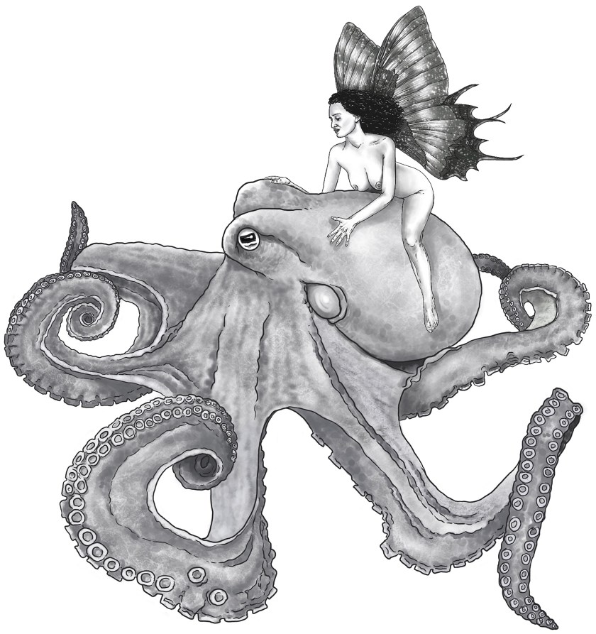
I’ve been exploring digital artwork, using an Apple Pencil and Procreate on an iPad, for several months now, and with this drawing I think I’ve gotten pretty close to what I can do with traditional pen and ink. I may add this to my RedBubble shop if I can figure out how to tag it in a description.

I just realized that, while I posted about my new edition of my novel Trapped In Lunch Lady Land, I never posted the cover art I created for it. I did this on an iPad with an Apple pencil using Procreate. I’m still getting the hang of digital art, but I’m really happy with how this turned out.


I drew this for a local exhibition almost 30 years ago, and I think it still has resonance today.


I’ve talked about this before on this blog, but I once spent several years as the main artist and designer for Stampers Anonymous, a well-regarded rubber art stamp company. The owner, Ginny (who continues to be a friend to this day) has an artistic sensibility, and a love for the weird, that dovetails nicely with mine. I loved designing stamps for her, and probably did hundreds throughout the years.
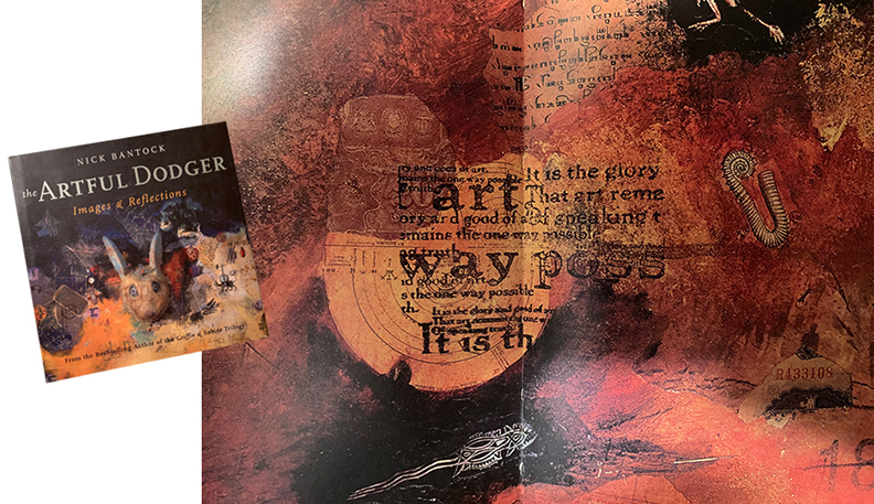
The rubber stamp community is passionately creative, and one of their favorite people is illustrator and collage artist Nick Bantock. He’s probably most famous for the Griffin and Sabine series, but he’s done many other art books as well. His collage work often utilizes rubber stamps, which is part of what endears him to stampers.
So I’m in Ginny’s stamp store one day, and she hands me Bantock’s lavish, oversized hardcover art book, Artful Dodger, and tells me to look at the collage in the center spread. Lo and behold, there, in the center of the collage, is one of my stamps. Probably the proudest moment of my stamp design career. Check it out below. That’s my artwork, the stamp featuring a quote about art, there in the middle.

I drew both of these for my Redbubble.com shop, but they got flagged. Weird, as a search for “Yoda” delivers more than 4,000 returns, and “Lord of the Rings” more than 5,000, but it’s not worth fighting about. Anyway, I loved working on both of these, and I learned a little more about using the Apple pencil with each one.


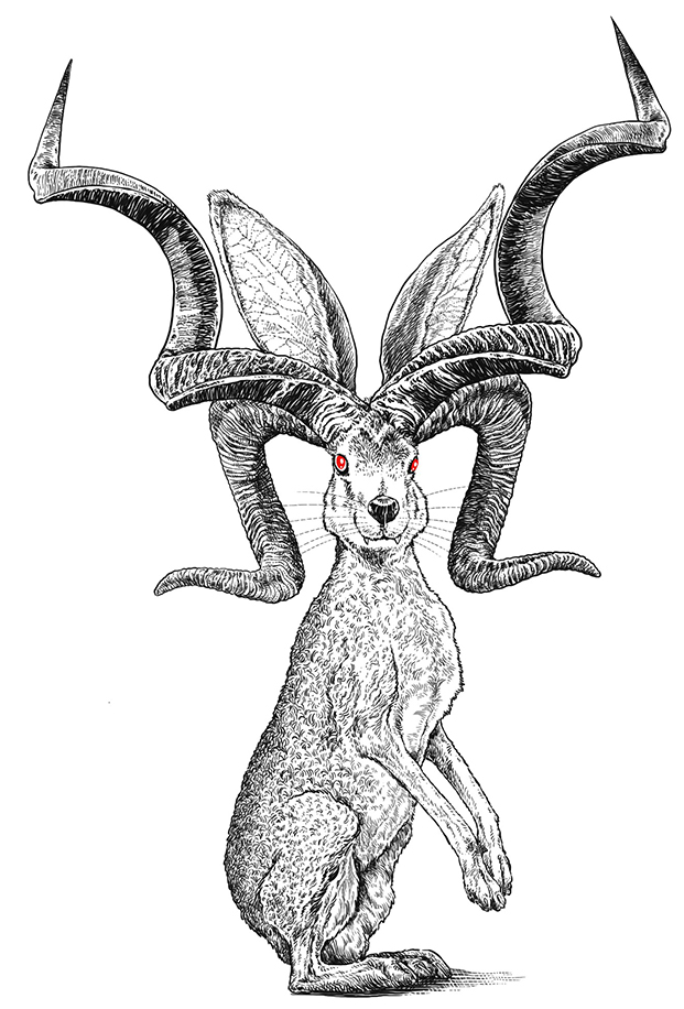
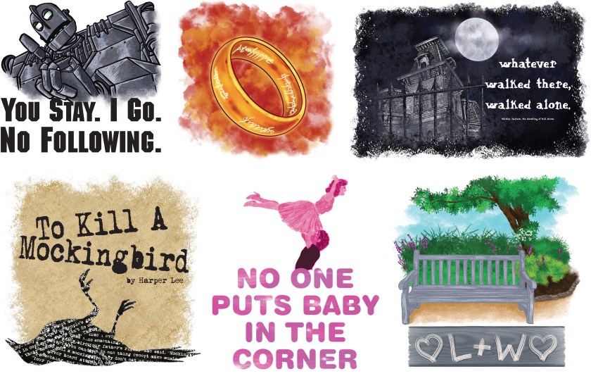
A couple of months ago I bought an I-Pad and an Apple Pencil. I realized quickly what a fun and versatile drawing tool I had with the combination, and an idea was born. Introducing Fan-tasm, a redbubble.com shop featuring artwork inspired by iconic books and movies. I’m working fast and loose, and really enjoying the process.
Here’s the link to my shop:
And here are a few samples of the kind of work I’m doing for this. I plan on adding lots more designs in the coming days. I’m also more than happy to take suggestions, or even custom orders. Drop me a line!
I’ve worked on a lot of logo art over the years. Here are a few samples.

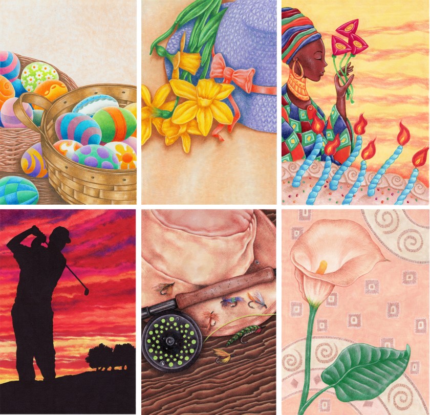
This is an older piece that I’ve always been fond of. I love working with Prismacolor colored pencils.


I finally broke down and got an Apple pencil to use with my iPad and, wouldn’t you know it, I love it. I can tell there’s going to be a steep learning curve to really figure out everything it can do, but here’s my first attempt. All things considered, I’m happy with it.


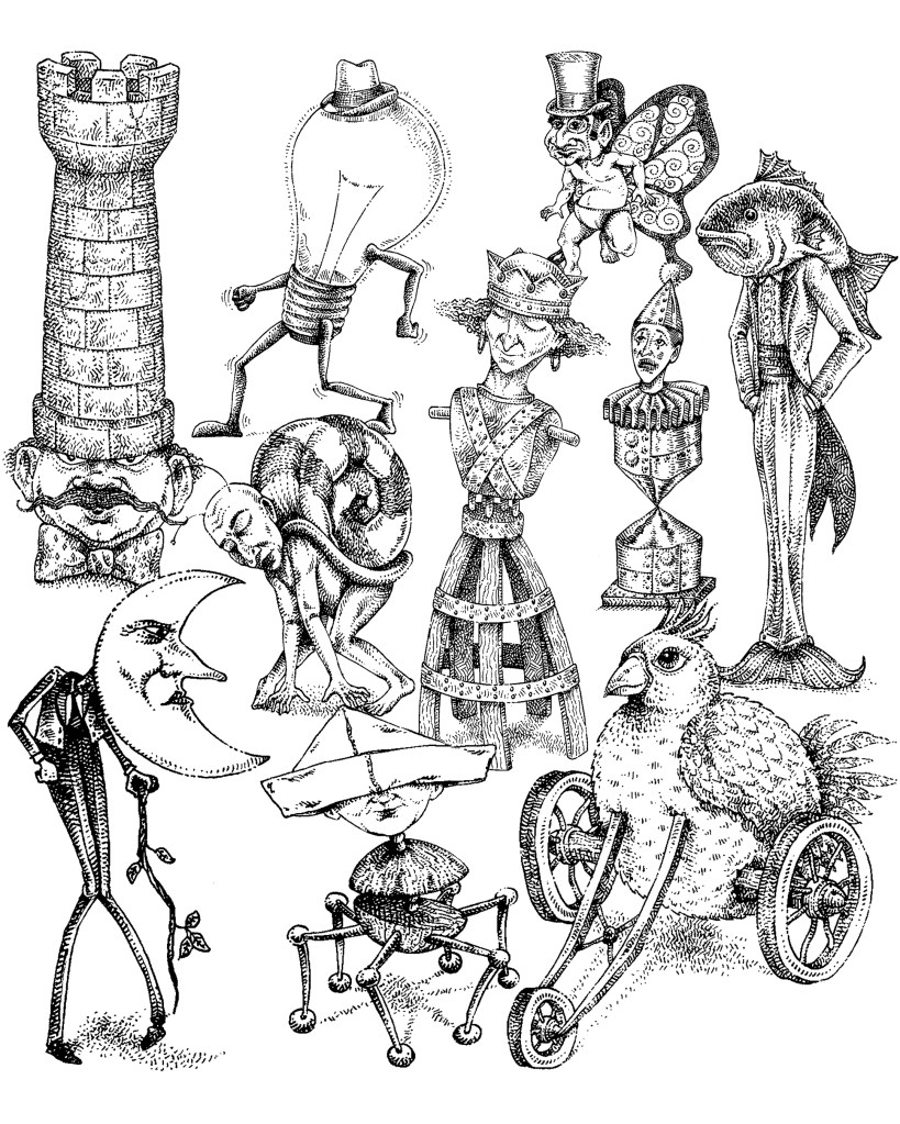
Rubber stamp art. These were all separate stamps, a series of unusual characters that were an indecent amount of fun to draw.

Many years back I worked with a a start-up kids TV show called The Magic Easel. Part of my job included designing the show’s opening sequence, which was a tour of the small town where the show was set. Just about all the art has disappeared into the great unknown, but here are some of the town sketches, plus the one piece of finished art I still have.


When I was a wee lad (okay, Junior High), I began to realize that creating art would be part of my future, and given that, I also began to notice the work of artists whose work I admire. Funny thing, though. While I appreciated many fine artists, particularly Dali and the other surrealists, the artists I gravitated to were illustrators—comic artists, magazine and book cover illustrators. They were doing the work I wanted to do. Here are some of those illustrators, the ones that made me want to be an artist. This is off the top of my head, and certainly not a complete list. I’ll start with the three illustrators mentioned above.
VIRGIL FINLAY and HANNES BOK—I’m lumping them together because for some reason I always think of them together. Both did extraordinarily imaginative, extraordinarily detailed work for pulp magazines on crappy pulp paper that in no way did their work justice. Truly inspiring.
http://www.artnet.com/artists/virgil-finlay/
STEPHEN FABIAN—I discovered Fabian in the pages of The Magazine of Fantasy and Science Fiction, and his work immediately stood out for the texture and shadow of his work.
https://www.stephenfabian.com/
FRANK FRAZETTA—I came of age in the seventies, so of course Frazetta is on this list, and not just because of his voluptuous women. His paintings have so much power, so much purpose. He’s a master of competition, and I love his paint handling. Boris Vallejo was working at the same time, in much the same market, but I always loved Frazetta more. As excellent a technician as Vallejo was, he was a little too polished for my taste. Frazetta was just more exciting.
http://frankfrazetta.net/
ROBERT CRUMB—Crumb is a master, pure and simple. Consummate style, humor, storytelling, and above all exceptional pen and ink technique. Hey may be a curmudgeon, but he’s my kind of curmudgeon.
https://www.crumbproducts.com/
BILL WATTERSON—Speaking of curmudgeons, Watterson is another one. Calvin and Hobbes is, to my mind, the finest comic strip ever made (nods to Doonesbury and Bloom County as right up there). Beautifully loose, expressive brush work. Watterson walked away from it when shrinking newspaper comic sections pissed him off. He lives not far from me here in Northeast Ohio, and it makes me happy just knowing he’s there.
https://www.gocomics.com/calvinandhobbes
WILLIAM STOUT—Another graduate of underground comics, Stout is just one helluva illustrator, with exquisite line work and amazing detail. Not as well know as he should be.
https://www.williamstout.com/
LEO AND DIANE DILLON—I worked my late teen years at a Waldenbooks, and Leo and Diane Dillon were responsible for some of my favorite book covers. An interracial married couple, the Dillons have a unique style all their own. Their work is instantly recognizable.
http://leo-and-diane-dillon.blogspot.com/
MURRAY TINKLEMAN—Often, right next to cover art by the Dillons, you’d find cover art by Tinkleman. His densely cross-hatched artwork is also instantly recognizable.
http://tinkelmanstudio.com/
DONALD ROLLER WILSON—Chances are you may not have heard of Wilson, and that’s a damn shame. Richly realistic, yet utterly fantastic, often hilarious, often featuring animals of all kinds. Wilson is a true original.
https://donaldrollerwilson.com/
ROBERT TUBBESING—Unless you grew up in Northeast Ohio, you probably haven’t heard of Bob Tubbesing, either. He taught commercial art at Maple Heights High School, my alma mater, and at Cooper School of Art, which I attended as well. Perhaps more importantly, he did some of the most inspiring pen and ink work I ever saw, filled with mysterious imagination. I believe he had some success as a gallery artist, but I couldn’t find any decent art links to include here.
Looking for links to include here, I was thrilled to discover that many of these artists are still doing exciting, vital work. Have a look for yourself, and get to know these inspiring illustrators.

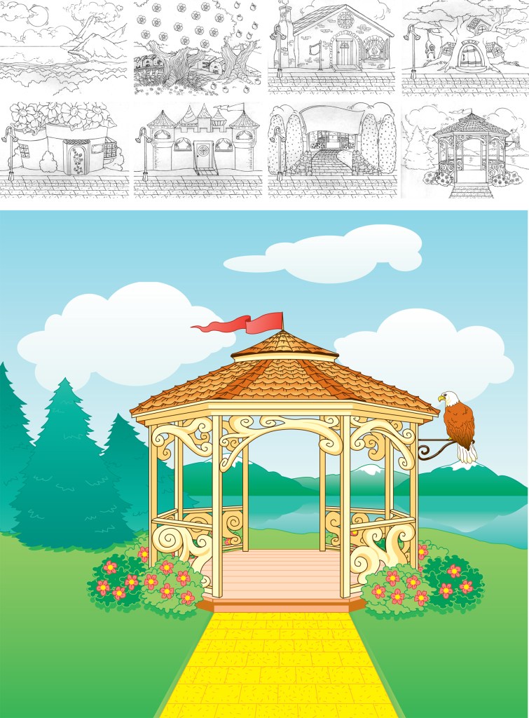
A few more pieces of art from the coloring book I did for Landoll’s Publishing.
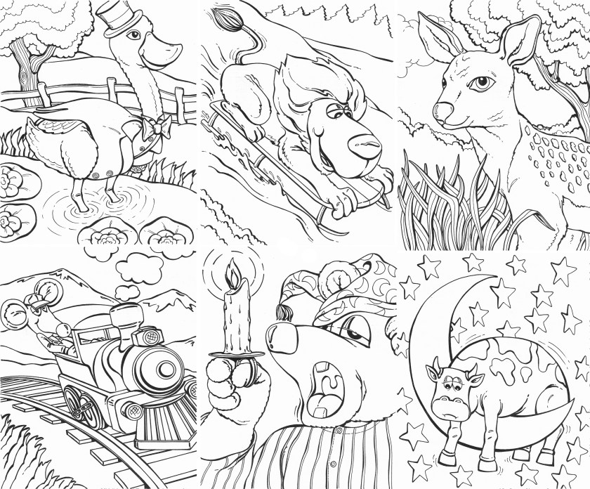

Landoll’s Publishing, down the state a bit in Ashland, hired me to do a 50 page coloring book. It’s shocking how hard it is to come up with 50 different ideas. Here are a few pages.


Here are a few examples of the greeting card art I’ve done over the years.

This was a fun experiment in textures and shapes.


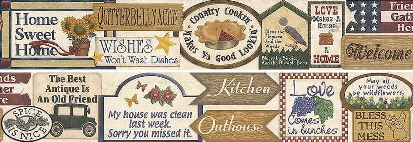
Here’s another wallpaper border I did, in markers and colored pencils. These borders were all incredibly time consuming—this one was 12’x6″, drawn to size—but fun to do.

This drawing is all that survives from my first, fumbling attempt to write and illustrate a picture book. I never submitted it anywhere, but I learned a lot working on it.


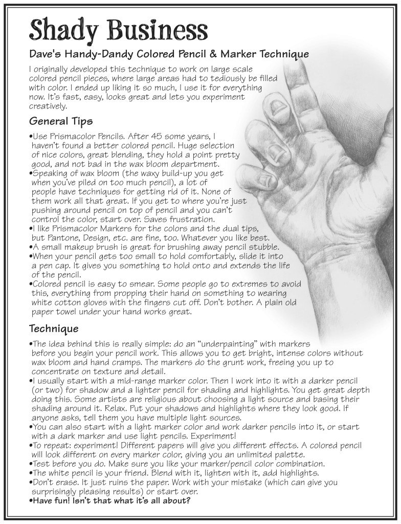
Back when I was designing rubber art stamps, my local stamp store (Hi, Ginny!) asked me to teach a class in coloring. Turns out, once stampers do their stamping, they sometimes like to color the resulting work. It also turns out that folks in the stamping community are uniformly delightful people, and the classes were great fun to do. This is a handout I prepared for the class, outlining some tips, and techniques that work for me. They may work for you as well.

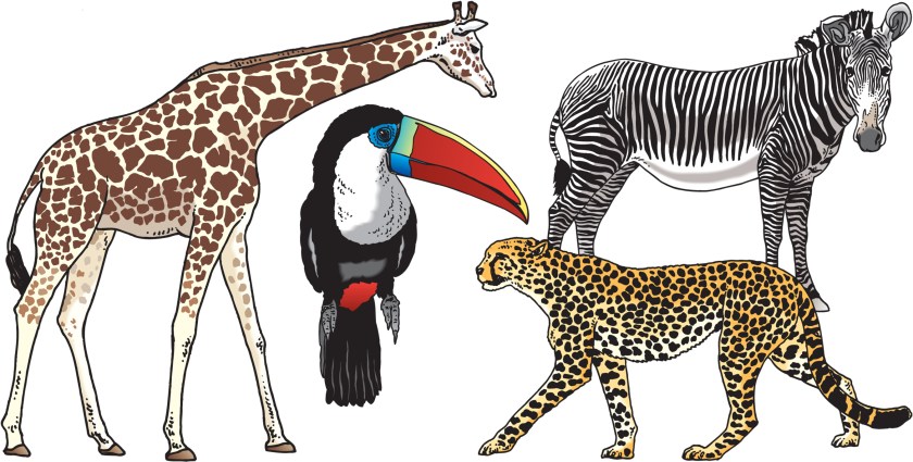
I drew dozens of zoo animals for a publishing company that creates products for zoo and museum gift shops. These were so much fun to do! Here are a few samples:

A few more life drawing sketches from high school and college.


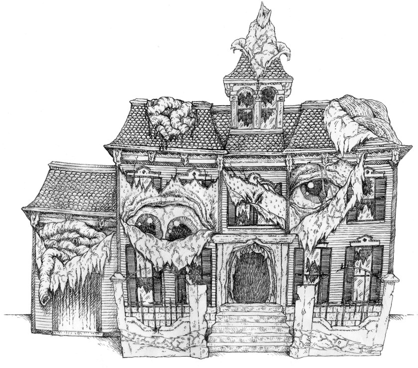
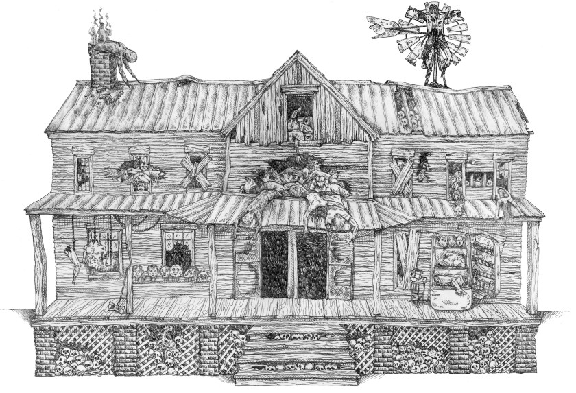
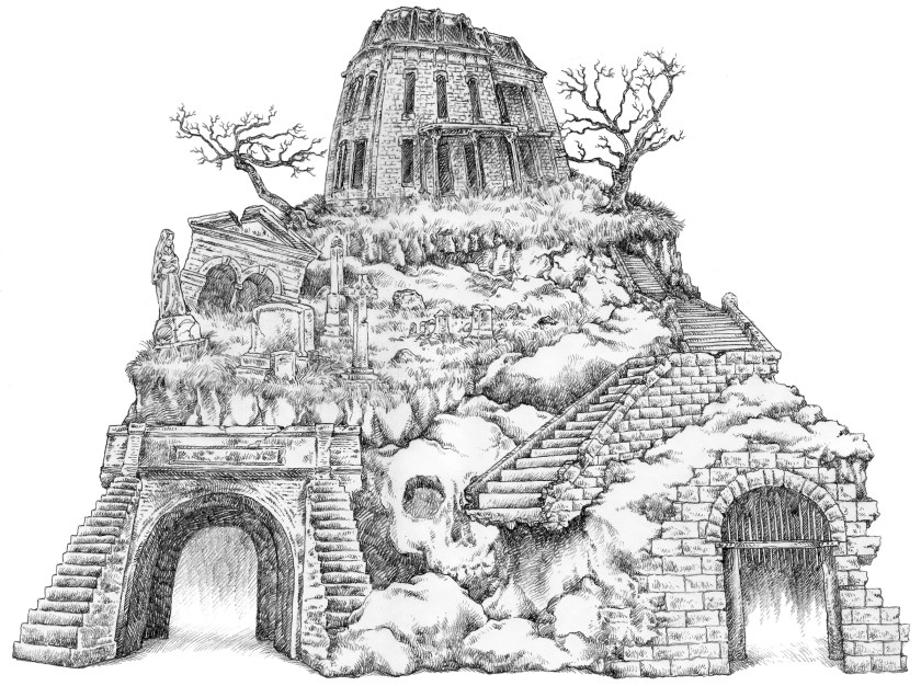
I posted these to my Twitter a while back, but I think they’re worth a blog post. I was hired to design haunted house facades by a company that fabricates them for the industry. These were a ridiculous amount of fun to work on. I call these Victorian Skin, Cannibal Farmhouse, and Haunted Hill.

This is an old piece, from way back in high school. Charlie Chaplin and Jackie Coogan in a movie called The Kid.


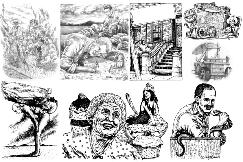
I’ve done a decent amount of magazine illustration work over the years. Here are a few samples. These originally appeared in Alfred Hitchcock Mystery Magazine, Now & Then, Gold & Treasure Hunter, and New Renaissance.

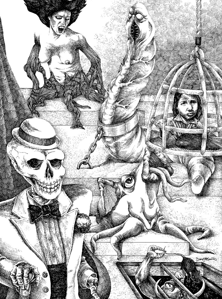
I love working in pen and ink, and this is one of my favorites of all the pieces I’ve done.

People seemed to like the sketches I posted before, so here are some more. I didn’t mention it last time, but these are two-page spreads, with an open area for text on each spread.

No idea why I never finished this, as I like the direction it was heading. But, that ship has sailed and I’m not going to finish now. I think it’s worth sharing, however.


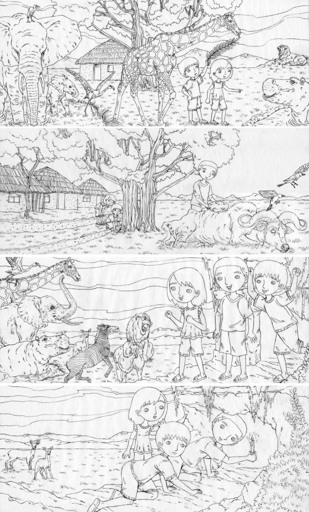
I worked on a picture book set in Kenya for the same publisher I did the Galapagos book for. The project fell through, but here are some of the sketches. This was fun—so many animals!


I think the name for this one kinda speaks for itself.